Finding Balance in Color and Character
How to Master Color Coordination to Build a Refined Wardrobe That Feels Natural and Sophisticated
The Psychology Behind Color and Perception
Color influences perception long before words or gestures do. The shades a man wears communicate confidence, creativity, and awareness. Each color carries emotional weight, guiding how others interpret presence and personality. Blue conveys reliability and calm, making it ideal for professional settings. Black communicates control and formality, while gray offers neutrality and restraint. Earth tones like brown and olive suggest warmth and approachability, while white expresses clarity and precision. Bright hues such as red or yellow command attention, often sparingly used to highlight individuality. The psychology of color extends beyond theory; it shapes self-image. Wearing certain tones can affect how one feels and behaves. A navy blazer might instill calm assurance, while a crisp white shirt signals readiness and order. Understanding this psychological influence allows men to use color strategically. The art of coordination lies in aligning emotion with intention, ensuring that what one wears reflects who one wishes to be. Mastering color is less about memorizing rules and more about recognizing its dialogue with personality.
The Foundations of a Balanced Palette
A wardrobe begins with a foundation of balanced tones that can adapt to multiple combinations. Neutral shades act as anchors around which bolder colors rotate. Black, white, gray, navy, beige, and olive form the backbone of timeless style. These hues complement one another and create effortless cohesion. Building from this foundation ensures versatility. Every man should own neutral essentials, shirts, trousers, and jackets, that form a consistent base for experimentation. Once stability exists, accent colors can enter naturally. Burgundy ties, green sweaters, or mustard scarves add depth and distinction. Balance comes from proportion; neutrals should dominate while accents introduce variation. Too many strong colors compete, while too few flatten personality. Finding harmony requires observation and adjustment. Each piece should flow into the next as if part of one continuous palette. A cohesive foundation makes dressing simpler, freeing attention for texture, layering, and detail. Balance is achieved not through abundance but through curation, where every color earns its place by contributing to harmony and confidence.
Understanding Contrast and Coordination
Contrast defines visual energy in clothing. It determines whether an outfit feels bold or subtle, sharp or soft. High contrast occurs when light and dark tones meet, like a white shirt beneath a black suit, producing sharp definition ideal for formal or structured looks. Medium contrast blends hues closer in brightness, creating sophistication without rigidity. Low contrast, where tones share similar intensity, generates smooth transitions and relaxed aesthetics. Coordinating contrast begins with awareness of complexion. Fair skin benefits from moderate contrast, avoiding extremes that overwhelm tone. Medium complexions pair well with strong pairings like navy and white, while deeper skin tones harmonize with rich neutrals or vibrant contrasts. The secret lies in matching the energy of contrast to context. High contrast communicates formality and confidence, medium contrast signals balance and intellect, while low contrast reflects calm and subtle refinement. Learning contrast allows men to sculpt visual hierarchy, guiding the eye naturally from focal point to frame without distraction or imbalance.
The Role of Season and Environment
Seasons influence how colors interact with light, texture, and emotion. Summer demands lightness, both in fabric and tone. Linen shirts in sand, sky blue, or white mirror the airiness of the season. Autumn, on the other hand, celebrates warmth and texture, browns, burnt oranges, and forest greens harmonize with deeper fabrics like wool and corduroy. Winter thrives on contrast and clarity. Navy, charcoal, and deep burgundy complement colder weather while maintaining polish. Spring calls for freshness, with muted pastels or soft greens that echo renewal. Beyond climate, environment matters equally. Urban settings reward monochrome coordination and minimalist palettes that blend with architecture, while natural environments invite organic tones and relaxed contrasts. Dressing with environmental awareness reveals adaptability. It reflects understanding of context, a hallmark of refined style. Choosing color seasonally does not require frequent reinvention but subtle evolution. Allowing wardrobe tones to breathe with time creates rhythm and continuity, letting clothing evolve as naturally as the seasons themselves.
Combining Patterns and Color Harmony
Pattern introduces complexity to color coordination. Stripes, checks, and prints add rhythm, but without thoughtful balance they can quickly overwhelm. The principle of harmony remains constant, patterns should echo, not compete. A bold plaid shirt pairs best with solid trousers or muted jackets. When two patterns meet, they must differ in scale; wide stripes complement smaller checks by preventing repetition. Color serves as the thread connecting patterns together. Choose one dominant shade that repeats subtly across pieces. This creates unity despite variation. Neutral bases help anchor patterns that would otherwise clash. When wearing multiple patterned items, limit the palette to two or three main tones for cohesion. Texture can also act as pattern, knit fabrics, suede, or corduroy offer visual depth without explicit design. Mastering pattern coordination builds from experimentation and restraint. Style matures when confidence grows from discipline, not excess. A patterned tie on a crisp shirt or subtle houndstooth blazer over muted chinos can express personality with sophistication rather than noise.
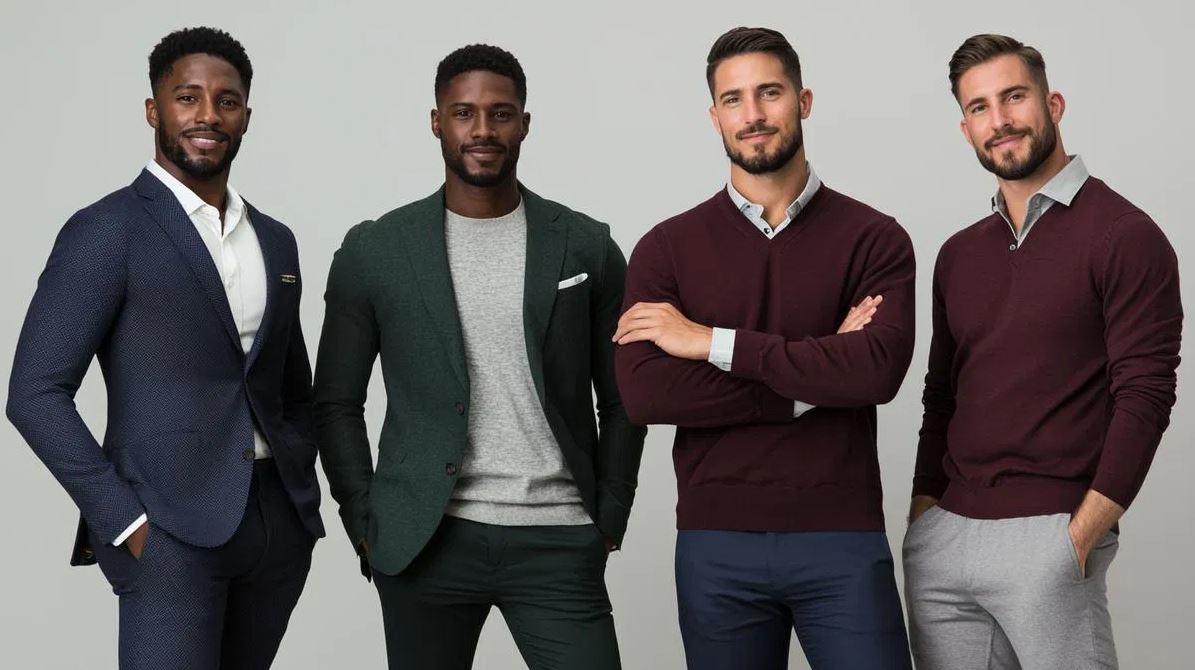
Color Coordination Across Formal and Casual Wear
Formality dictates not only cut but also color harmony. Formalwear relies on contrast and simplicity. Dark suits in navy, charcoal, or black paired with white or pale shirts establish authority and precision. Accents like ties and pocket squares introduce color carefully, often restricted to one or two tones. For business environments, muted blues, maroons, or grays communicate seriousness without monotony. Casualwear allows greater freedom. Earth tones, faded washes, and textured fabrics open room for creativity. Layering different shades of similar colors creates relaxed coherence. For example, pairing a tan jacket with beige trousers and a cream shirt builds a unified gradient. Denim adds neutrality, functioning as an intermediary between bold and plain. Weekend wear benefits from controlled spontaneity, a splash of color without breaking harmony. The key across both spectrums is intention. Every color must have purpose. Whether commanding a meeting or relaxing at a café, consistency in tone and coordination conveys thoughtfulness. Men who understand this balance project maturity through both attire and attitude.
The Influence of Accessories on Color Balance
Accessories provide subtle opportunities to reinforce or redirect color balance. Watches, belts, shoes, and eyewear connect ensembles together through understated repetition. A brown leather belt matched with similar shoes establishes visual flow, while a silver watch complements cooler tones like gray or navy. Pocket squares, ties, and scarves act as punctuation marks, introducing personality without disturbing composition. Jewelry should mirror outfit undertones, gold complements warm palettes, silver cool ones. Socks, often overlooked, can harmonize or contrast playfully depending on setting. Bags and outerwear extend palette consistency, ensuring that every visible layer contributes to unity. The goal is coherence without predictability. Accessories should never outshine the outfit; they should complete it. The most refined combinations appear spontaneous yet intentional. Through accessories, men can adjust tone dynamically, shifting from formal to casual with a change in texture or metal tone. Attention to these smaller connections demonstrates discipline, confirming that sophistication resides in the details that quietly bind the whole together.
Common Mistakes and How to Avoid Them
Color coordination falters when intent fades into excess. One of the most common errors is overmatching, repeating the same hue across multiple items until the result feels artificial. Variety in tone prevents monotony. Another mistake lies in ignoring undertones; mixing warm and cool shades without transition leads to imbalance. For example, pairing orange with a cool gray can clash unless a neutral intermediary softens the contrast. Neglecting context also undermines coordination; bright or experimental colors that suit casual settings may appear out of place in formal ones. Poor fabric pairing disrupts visual unity, as texture interacts with light differently across materials. Maintenance matters too, faded black, discolored whites, or uneven dye can ruin coordination regardless of planning. Avoid extremes of contrast unless deliberate. Subtlety wins longevity, allowing color to enhance personality rather than distract from it. Awareness grows with observation. The mirror becomes a tool not of vanity but of adjustment, where lessons learned refine judgment until color becomes instinctive rather than forced.
Confidence Through Color Awareness
Mastering color coordination begins with observation and ends in confidence. Every tone tells a story, every pairing communicates intent. Men who understand color build wardrobes that feel coherent, expressive, and adaptable. Awareness transforms uncertainty into control. Dressing becomes less about conformity and more about creativity guided by structure. When colors align with complexion, environment, and purpose, style transcends fashion. Confidence follows naturally because balance has been achieved through understanding. Color coordination is not about spectacle; it is about clarity. The goal is to appear composed, not calculated. When clothing reflects internal order, others perceive authenticity. Each outfit becomes an unspoken message of presence and poise. Over time, mastery of color reveals maturity, the ability to project personality without excess. The man who understands how colors converse does not chase attention. He commands it quietly, through harmony, subtlety, and assurance in his own aesthetic rhythm.